Experimenting with different techniques such as watercolours, lino printing, digital experimentation and collage, Year 10 Graphic Design students have been working on their tourism project, to design and create traditional promotional travel posters for their favourite destinations around the world.
Their brief was to choose their own favourite destination and create a traditionally styled poster that promotes local tourist attractions and places to visit; for the poster to be appealing and informative, but at the same time individual and creative. The designs incorporated in the posters have to be adaptable, able to transfer to merchandise such as mugs, keyrings, stickers and other marketing materials; the students will eventually use the sublimation printer to actually transfer their designs onto and create their own mugs.
The initial exploration stage has seen students thinking about their holiday destinations, what they enjoyed and what they think others might like about those places, countries and activities you can do while there. As well as deciding upon a destination to advertise, students considered different graphic styles they might like to feature as well as taking inspiration from their favourite and/or chosen artists and/or designers. Preliminary sketches helped them to lay out and see their visualisations of their concepts, eventually laying these out digitally and storing online as part of their portfolios, and the creation of mood boards to help organise their project concepts as well as assist with visualisation and communicating of their ideas to themselves and others. The design of their poster came to life throughout this process, and so they began to put pen, paint, acrylic, pencil, watercolour, POSCA to paper – different students choosing and using different techniques to create and bring their designs to life.
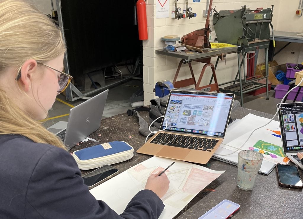
Having chosen Norway for her destination, Millie shared,
“My Mum is from Norway and we visit at least three or four times a year, so that’s why I chose this particular destination and country. Norway is a beautiful place and I love the style of the buildings; they’re mostly wooden with very little brickwork, and they’re white and clean.” She continued, “My poster is advertising small villages and towns as well as things to do while you’re visiting, I’ve based this on my own knowledge and experience and it’s going to feature boating, hiking, sight-seeing and the mountains as they’re particularly stunning. My artist inspiration is Ruth Allen who uses watercolours and fine lines. I’ve always wanted to experiment with this technique and have the chance to give it a try and so this seemed the perfect opportunity, I think it will capture the beautiful simplicity of Norway in the way that I want it to.”
Talking about learning Graphic Design Millie said,
“I love this subject, most of all the independence and freedom I have to not only think about and plan each project, but for the execution. We always have plenty of time to do what we need and want to do, and to take time to enjoy it too – which I think is the most important part of this. I’d love to think that I could go forward with a career that focuses on or features Art, and so that’s why I love Graphic Design particularly.”
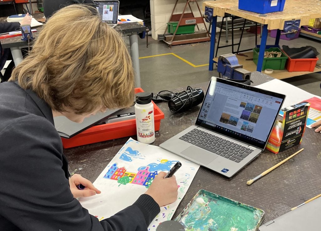
Laura and her family have visited Amsterdam several times on holiday together, and she fondly remembers riverboat tours where you can see all of the houses and much more of the country. She shared,
“My poster will feature the beauty of the city, showing people what a lovely place it is to visit. I’m inspired for this project particularly by the artwork of Beckim M, a bold and vibrant artist whose work features simplistic shapes which I really like.”
She continued, talking about the materials, method and style of her poster,
“I’m going to be using POSCA pens, which are paint marker pens essentially. I did think about and try collage, but I’ve decided this method offers a much larger range of colours and the finished poster will look vibrant while hopefully being simplistic and beautiful at the same time – reflecting the style of the artist I’ve chosen and the way I feel about the country and what it offers visitors”
Working with different materials, tools, techniques and taking inspiration from artists and designers around the world, students have access to a wealth of knowledge and expertise in the teachers who provide support, assistance and direction where needed, as well as continual encouragement to be creative and individual. This project demonstrates clearly how one brief can be interpreted in many different ways and styles, while all meeting the overall objective and initial brief. Mrs Cracknell, Head of Design at Woodbridge School added,
“Graphic Design as a career is ever changing but many of the traditional methods and skills that are needed are still highly important. As a graphic designer you must be willing and able to turn your hand to a range of artistic techniques, and therefore, this project enables the students to experiment with various processes, both digital and hand generated, in order to achieve an outcome that not only responds to the design brief but also boasts individuality and creativity. The work the students have created so far are all completely original and designed entirely by them. They should be very proud.”
For more information, visit Creative and Graphic Design Studies.

